EMPOWERING PEOPLE
Telstra Self-service Channels Authentication
Telco
|
Self-service
|
Portal
|
Research
|
Design
|
UX
|
IA
|
Ideation
|
Prototype
|
CRO
|
Mobile App
|
Website
|
Telco | Self-service | Portal | Research | Design | UX | IA | Ideation | Prototype | CRO | Mobile App | Website |
Taking customer feedback seriously means moving from awareness to action. Using a lean scientific approach, backed by empirical evidence and a little experimentation, we ensured customer and operational success.
Customers hold businesses to account after purchasing a product or signing up for a service. They expect to receive specialist troubleshooting and continuity of support to get more bang for buck.
Let’s face it, for customers, this looks like specific trips to the shopping centre, waiting in long call queues, or endlessly trawling website FAQs for vital answers, consuming a lot of time and effort out of the day. We get left feeling frustrated and anxious for what should seemingly be an easy process. How businesses address these challenges can make or break loyalty to a brand.
Addressing requests for support, costs organisations millions of dollars eating into the bottom line. The opportunity cost; is the time and effort of support channel resources that could better focus their attention on more complex, lead-generating or sales-driven ticket items.
A range of activities can effectively reduce the burden and alleviate pressure on support channels. These include identifying data-driven hypotheses, usability testing for task analysis, dual-path design solutions, and split-variant testing, coupled with meticulous performance tracking. By adding these activities to our process, we possess a unique ability to identify and address underlying frustrations that arise when overseeing services and at what point they specifically happen.
We gain valuable insights and actionable intelligence at every stage of the process, continuously refining and optimising our services for maximum efficiency and customer satisfaction.
Engagement Details
-
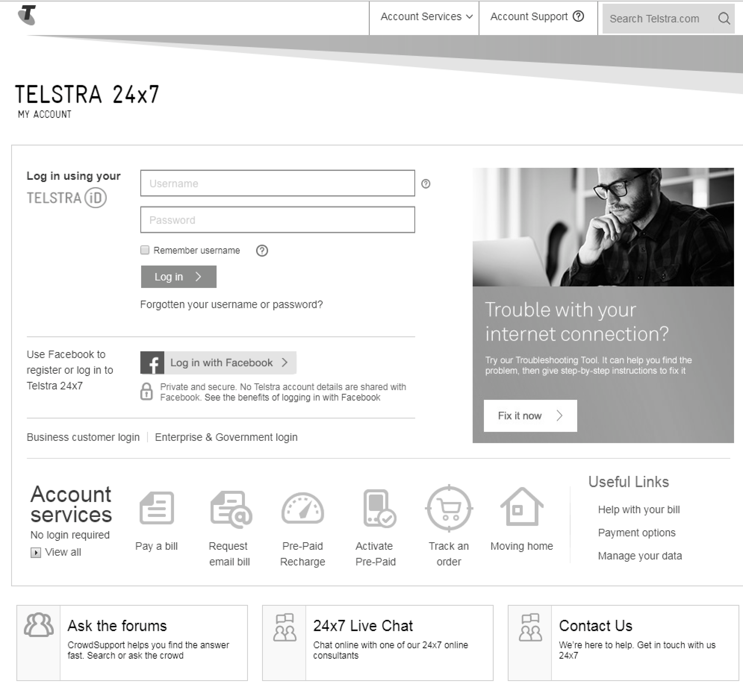
Customers faced login issues due to forgotten credentials, preventing them from accessing their accounts for all their service and billing needs.
Telstra has a suite of websites and apps that help Australians connect using the forefront of communication technology.Approximately 1.7 million visitors access the My Account Portal per billing month, to gain information specific to their account. The users are dependant on a platform that is easy to access whilst guaranteeing their privacy.
Part of ensuring the utmost security measures is having an effective front door. Elements of an authentication process typically include text field entries for users to fill in credentials, pre-population or third-party logins and sign-up options.
We found an addressable volume of 42k requests around gaining access to accounts. We dug deeper to understand the issues associated with logging in. What we found was startling…
Recovering Username Insights
62% of customers successfully submit a request to recover their username via their email address
19.8% of customers exit the site without attempting to reset their username
Only 4.5% of customers log on to my account
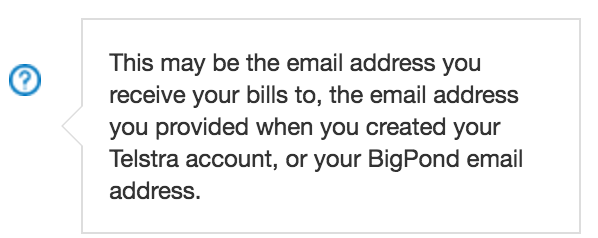
The username hint is not very useful
An incorrect combination of credentials can be filled out and the email would still get sent to them
No understanding of whether the username should be the account holder vs service user
Reset Password Insights
31% exit the site without attempting to reset their password
Only 18% of customers successfully had their password reset email sent
The username hint is not very helpful
Validation in place for password reset
No idea of which email address the password is sent to
Customers were frustrated with the complicated authentication process, so they contacted support. The confusing digital experience left customers dissatisfied costing everyone an excessive amount of time, money & effort.
THE CHALLENGEWe've all been there before. Too many usernames, too many email addresses, too many passwords. You must use a capital letter. You must use a symbol in your password. Sometimes we forget our details. Sometimes our password key-chain fails to deliver. And sometimes we need a little something to jog our memories. Hence the tooltip...
We focused on the usage of tooltips across multiple digital assets (My Account, Registration Portal and the online shop t.com). Tooltips are commonly used to reduce mental fatigue, giving users the ability to access further information to the relevant field entry if needed.
Support channels identified many customers who were having trouble gaining access to their accounts because they weren't able to figure out their details. The experience was disjointed and customers would receive a generic email regardless of whether or not they were successful in entering their verification details.
What if our target audience weren't utilising the tooltip due to a lack of technical and affordance know-how? Was the information valuable? Was it helpful? We aimed to reduce the number of enquiries by half (21k).
BUSINESS GOALS
Reduce account login-related calls
Reduce in-store queries
Increase the success rate of the forgotten username/password process
Understand tooltip performance
Identify pitfalls of existing flow
USER GOALS
Inspire action to access help documents
Improved hints on user credentials
Real-time email response to reset password request
Understand when successful filling out credentials
Strengthen confidence in task completion through confirmation
Know where reset password link has been sent to
-
Review the authentication process. Collect data-driven hypotheses, set a baseline & SMART goals. Split-test designs in usability testing sessions. Measure task performance, analyse results and iterate accordingly.Our previous design approach was to implement the usage of tooltips anywhere we sought fit. But, sometimes we can be too eager to jump into solution mode when we haven’t fully understood the nature of the problem. Sometimes best practice isn’t necessarily best practice. So we conducted Usability Testing sessions to validate the need for information to be displayed to the user upfront.
Our solution was to further split-test the live site and record metrics. This provided us with quantitative data that showed which design would be more beneficial to our users. It was important to have metrics to back up the insights collected from testing sessions considering the multitude of users who access Telstra's Websites and Apps.
THE IDEA
Provide information to jog memory of users and automate customised responses via email for each instance. As cases of fraudulent behaviour were ever present, we had to be sensitive about what we could disclose as prompts.
We asked usability testing participants what they would do if they forgot their details and observed their actions. We split-tested variants of screens with/without tool-tips to gain insight into their sentiments. By tweaking one design aspect, we could measure the impact of the tool-tip's performance on success. We monitored metrics after each change and found which experiment led to success. This identified the most effective design changes.
-
Microscale improvements to the forgotten username and password flow had a resounding effect with drastic results that were achieved for both customers and Telstra...
By focusing our attention on providing a user-centric experience, we found a reduction in customer enquiries to Telstra's Global Call Centres, allowing the user to resolve their issues online, as opposed to prompting them to call for assistance. This aided:Alleviating the existing high pressure on call centre staff and shop assistants,
A reduction in staff required to resolve customer challenges,
Less wait times for customers to speak to a Telstra assistants,
Increased efficiency and usability of My Account and the Registration Portal (T.com)
-
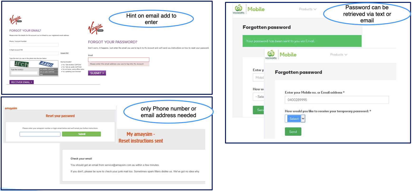
Competitive Analysis & Benchmarking
We looked at competitor treatment to optimal experience and flows.
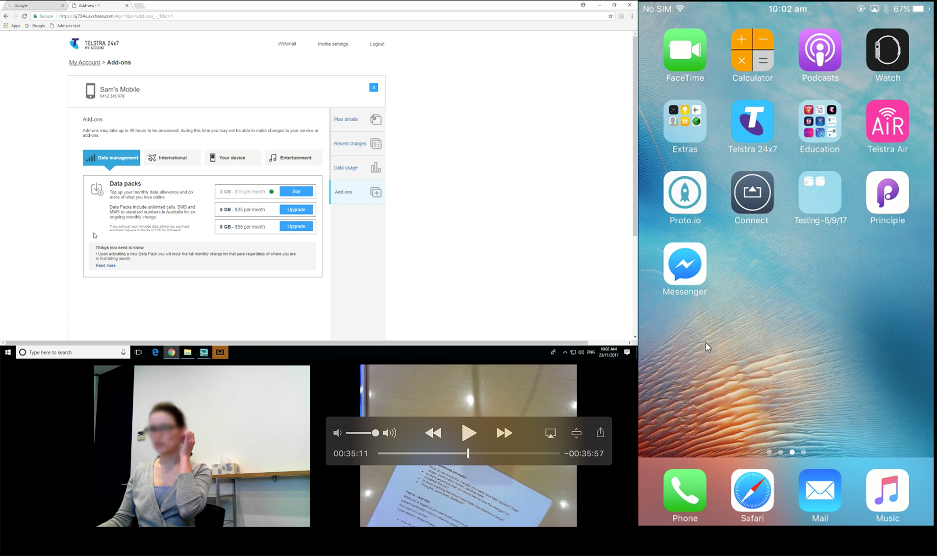
Usability Testing & Analysis
We ideated two potential solutions in a prototype which we tested with existing Telstra customers who had forgotten their details.
The goal was to investigate the assumptions we had about how our users reacted to aspects of our design.
The session results enabled us to receive valuable feedback, both verbal and behavioural. Conducting these sessions helped us make better informed decisions to iterate or pivot as necessary.
What participants said and did…
4/5 users didn’t hover over the tooltip to access information and clicked straight on the “Forgotten username” link
4/5 participants acknowledged the information related to the field entries was useful
Some users mentioned they would prefer their details to be sent to them by SMS
All interactive links were in muted tones to see whether the colour of the tooltip would increase engagement
LANDING PAGE SENTIMENT
“I like how it’s explained. Yeah, I think that’s everything you need to know.”
“Useful? Could be. Yeah, because obviously when you need it you know how important that page is.”
“Absolutely, because there has been cases where I’ve had like maybe and old, two addresses and a home address or like a PO box… So yeah, definitely beneficial”
“I want an SMS. Yeah, so I like SMS things because its easier than having to enter your email and then get all of the details and then going to your email.”
TASK FLOW
“Ahhh, that helps though… I might try my email address and then I’d click on forgotten username.”
“I’d just click on forgotten username and password.”
“And it’s got little help things too. Pretty simple, good.”
“I always ignore them unless I get really stuck. Cause at first, no I didn’t (notice the tooltip)”
VARIANT PREFERENCE“The less copy the better, simple and clean. You don’t need all that copy unless you’ve got a problem.”
“I guess if you put in the wrong email address, thinking that its the right one, it does show you the other options available.”
“I like this one (Variation B) more cause its got more detail… It’s a little easier on the eyes. Everything is there infront of you”
“A lot of people don’t know about the question mark, to hover over it. I guess less tech savvy older people. So that’s quite straight forward.”
“I prefer this because it give a little prompt of what the email address is or which phone number… This is my preference.”


